 |
| Claude Monet, Public domain, via Wikimedia Commons Study of a Figure Outdoors: Woman with a Parasol facing left Musée d'Orsay |
INTRODUCTION
Juxtaposition is one of the most powerful techniques in the art of painting, providing a means for artists to create contrast, tension, harmony, and meaning by placing distinct elements side by side.
Derived from the Latin roots juxta (next) and positio (positioning), juxtaposition refers to the deliberate placement of differing or opposing elements to highlight their differences or, paradoxically, to create unity through contrast. In painting, this technique is most commonly associated with the interplay of color, form, light, and subject matter.
Over centuries, artists have employed juxtaposition to enhance visual impact, convey philosophical depth, and captivate the viewer’s eye.
This essay presents a comprehensive examination of juxtaposition in painting, detailing how it is achieved, its various aspects, and analyzing seven masterpieces by renowned artists where juxtaposition of colors serves as a defining characteristic.
How Juxtaposition Is Achieved in Painting
Juxtaposition in painting is not a matter of coincidence; it is born from deliberate artistic choices that direct how a viewer experiences and interprets an image. When artists place contrasting elements side by side—whether in terms of color, light, texture, scale, or subject matter—they create visual tension that sharpens meaning, heightens emotion, and often prompts reflection. This technique has been central to painting across centuries, appearing in vastly different artistic movements from the drama of the Baroque to the abstractions of modernism.
What follows is an exploration of the ways in which juxtaposition manifests in painting. By looking at its various forms—color contrast, light and shadow, texture, scale, thematic opposition, and spatial design—we can better understand how painters deliberately shape visual experiences and communicate layered ideas.
Color Contrast: The Vibrancy of Opposites
One of the most immediately striking forms of juxtaposition arises from the use of color. When complementary hues are placed side by side, their differences amplify each other. Red appears more fiery when paired with green; blue seems deeper and more intense when framed by orange. This phenomenon is rooted in the science of optics, but artists have long understood it intuitively.
Vincent van Gogh was particularly masterful in exploiting this relationship. In his famous painting The Night Café (1888), he surrounded the red walls of the room with green billiard tables and lampshades, creating an unsettling vibrancy that mirrors the emotional disquiet he described in letters about the scene. For van Gogh, juxtaposition of color was not merely decorative—it was expressive, a way of infusing a psychological charge into the environment.
The Impressionists, too, explored color contrast to heighten luminosity. Claude Monet’s use of purples against yellows or blues against oranges was carefully considered to intensify the sensation of light. By positioning such opposites together, painters transform the flat canvas into a pulsating visual field, reminding us that juxtaposition is often as much about feeling as it is about form.
Light and Shadow: The Drama of Chiaroscuro
|
| Claude Monet, Public domain, via Wikimedia Commons Study of a Figure Outdoors: Woman with a Parasol facing left Musée d'Orsay |
Another powerful method of juxtaposition lies in the manipulation of light and dark. Known in art history as chiaroscuro—a term derived from Italian meaning “light-dark”—this technique contrasts illuminated areas with deep shadow to create depth, drama, and psychological intensity.
Caravaggio, perhaps the most famous practitioner of chiaroscuro, mastered this interplay. In works such as The Calling of Saint Matthew (1599–1600), a shaft of light cuts across a dimly lit room, singling out figures and infusing the narrative with spiritual significance. The darkness surrounding the illuminated subjects is not mere background; it is an active, dramatic counterpoint that heightens the sense of divine intervention.
Later painters, including Rembrandt and Georges de La Tour, adopted similar strategies. By juxtaposing the brilliance of light with enveloping shadow, they created not only visual contrast but also symbolic resonance—light often serving as a metaphor for truth, revelation, or salvation, while darkness suggested ignorance, danger, or mortality.
This interplay continues into modern painting, where even abstractionists like Mark Rothko used dark and luminous tones to create emotional juxtapositions, though without representational imagery. The lesson is consistent: light gains power only in relation to darkness, and shadow achieves meaning when placed beside illumination.
Texture and Brushwork: The Tactile Dimension
Juxtaposition is not limited to visual elements; it can also be felt, or at least suggested to the eye through texture and brushwork. Painters who alternate between smooth, polished surfaces and rough, impasto strokes within the same composition invite the viewer to sense material contrast.
Diego Velázquez’s Las Meninas (1656) demonstrates this beautifully: while the figures’ faces are painted with great delicacy, their clothing reveals bold, loose strokes that seem to shimmer. The difference in surface treatment creates a visual rhythm, a tension between refinement and spontaneity.
In modern art, texture became even more central. The Abstract Expressionists, such as Jackson Pollock or Willem de Kooning, often juxtaposed chaotic, aggressive brushstrokes with quieter, more controlled areas. The resulting tension between order and disorder reflected not only the artist’s physical process but also deeper existential questions about chaos and meaning.
Through texture, painters remind us that contrast is not always about image alone—it can be about how paint itself behaves on canvas.
Scale and Proportion: The Play of Size
Size itself can be a tool of juxtaposition. When artists place large and small forms together, they establish hierarchies of importance, suggest vulnerability, or dramatize scale.
Consider the tradition of history painting, where monumental figures often tower over diminutive ones to convey power or divinity. Michelangelo’s Sistine Chapel ceiling (1508–1512) is full of such contrasts: heroic, muscular prophets dominate the architectural framework, while smaller decorative figures highlight their grandeur by comparison.
Modern artists often use scale to subvert traditional meanings. In René Magritte’s surrealist paintings, for instance, objects are frequently shown at absurdly disproportionate sizes—an apple filling an entire room, or a boulder floating among clouds. The juxtaposition of expected and unexpected scale destabilizes our sense of reality, reminding us of painting’s power to reframe perception.
Thematic Juxtaposition: Oppositions of Meaning
Perhaps the most profound form of juxtaposition lies not in formal choices but in subject matter. When artists bring together opposing symbols—life and death, beauty and decay, nature and technology—they invite viewers into the realm of ideas and interpretation.
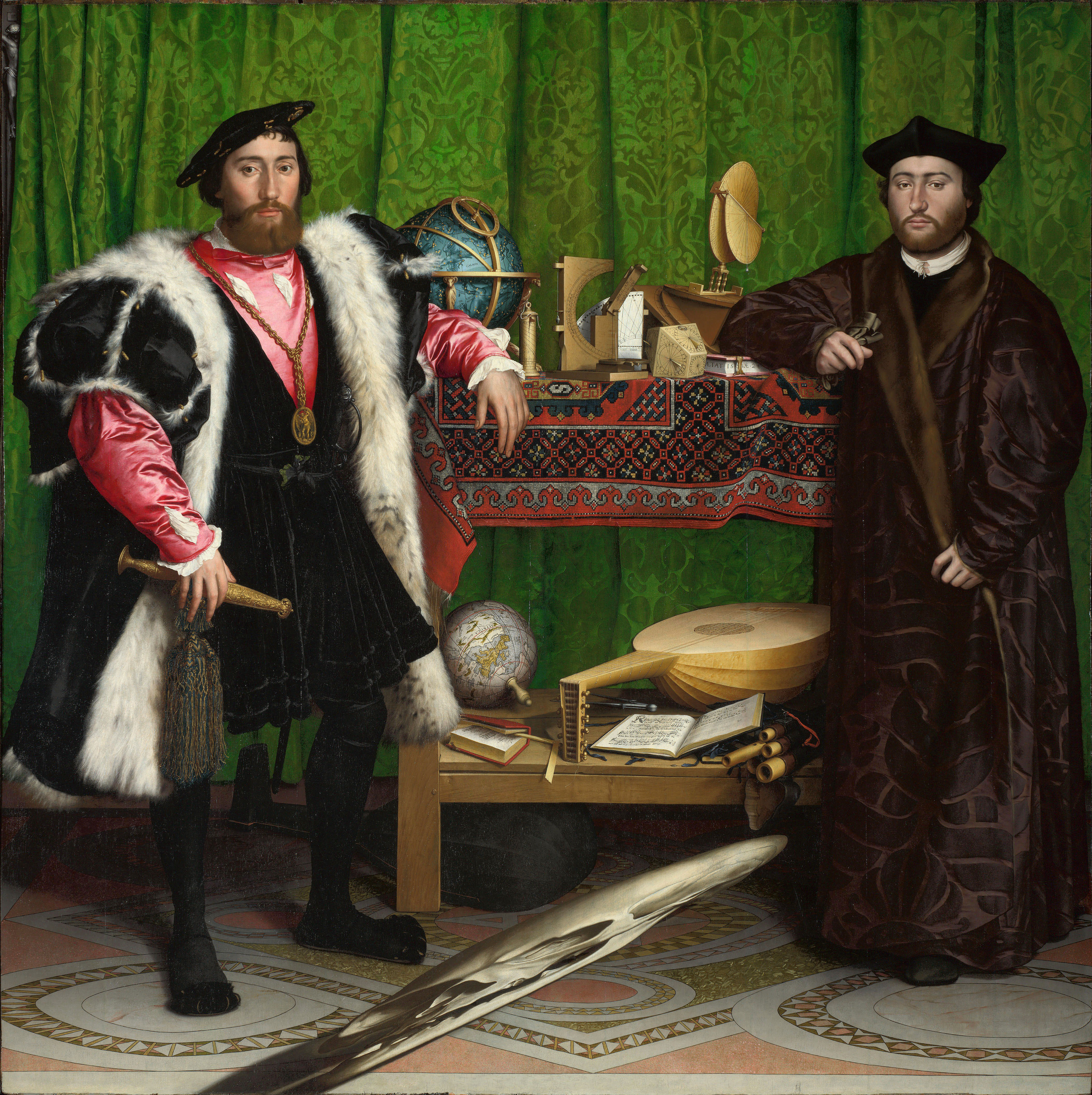 |
| The Ambassadors (1533) Hans Holbein the Younger, Public domain, via Wikimedia Commons |
This juxtaposition of worldly achievement with the inevitability of death communicates the Renaissance concept of memento mori, the reminder that life is fleeting.
Contemporary painters continue this tradition. Environmental artists often juxtapose natural imagery with industrial or technological symbols to comment on ecological fragility.
The pairing of seemingly incompatible elements forces viewers to grapple with the tension between human progress and environmental cost. Through thematic opposition, juxtaposition becomes a tool of storytelling, philosophy, and critique.
Spatial Juxtaposition: Foreground and Background
Finally, juxtaposition can also be achieved through spatial arrangement. The relationship between foreground and background, near and far, allows artists to create dimensionality and narrative emphasis.
In Renaissance perspective painting, foreground figures were often contrasted with distant landscapes, establishing both physical depth and thematic hierarchy. In Leonardo da Vinci’s Mona Lisa (1503), the serene figure is set against a mysterious, rugged background, a juxtaposition that enhances her enigmatic presence.
In modern abstraction, spatial juxtaposition is less about illusion and more about compositional energy. Painters like Piet Mondrian used flat grids and planes of color to juxtapose areas of activity and rest, generating visual balance through spatial opposition rather than depth.
The Power of Deliberate Contrast
Juxtaposition in painting is far more than a stylistic trick. It is a central tool of artistic expression, enabling painters to heighten perception, evoke emotion, and provoke thought. Whether achieved through color, light, texture, scale, theme, or spatial design, juxtaposition brings energy and complexity to the painted surface.
By deliberately placing opposites side by side, artists remind us of the interconnectedness of contrasts—light cannot exist without dark, beauty without decay, grandeur without vulnerability. Juxtaposition, in its many forms, mirrors the paradoxes of human experience itself.
Through these strategies, artists create both visual and emotional resonance.
Aspects of Juxtaposition in Painting
Juxtaposition manifests in several aspects of visual art:
Emotional Juxtaposition: Contrasting moods in color (warm vs. cool) evoke psychological complexity.
Symbolic Juxtaposition: The pairing of objects with divergent meanings highlights contradictions in human experience.
Formal Juxtaposition: Abstract artists employ pure shapes, tones, and color fields side by side to explore balance.
Stylistic Juxtaposition: Combining realism with abstraction can shock or intrigue the viewer.
Each of these aspects enriches the interpretive potential of the artwork.
Seven Paintings Exemplifying Extraordinary Juxtaposition of Colors
Below are detailed examinations of seven paintings by master artists that display exceptional use of juxtaposition through color.
1. “The Night Café” by Vincent van Gogh (1888)
 |
| The Night Café Vincent van Gogh, Public domain, via Wikimedia Commons |
The harsh red walls clash with the green ceiling, creating a dissonant effect that mirrors the oppressive atmosphere of the café.
Van Gogh himself wrote that he aimed to depict the café as a place “where one can ruin oneself, go mad, or commit a crime.” The juxtaposition of vivid, almost garish colors embodies psychological unease, amplifying the emotional content of the scene.
The greens are not calm, natural greens but acidic, almost sickly tones, while the reds are heavy and foreboding. In color theory terms, this juxtaposition is complementary but destabilizing, breaking away from harmony to produce disquiet. The pool table, painted in deep green, serves as an anchor in the composition, yet it too is surrounded by threatening red, highlighting entrapment. This choice creates an immersive psychological experience that makes the viewer share in Van Gogh’s emotional turmoil.
2. “The Persistence of Memory” by Salvador Dalí (1931)
Though often remembered for its surreal imagery, Dalí’s The Persistence of Memory employs striking juxtapositions of color and form. The warm golden-orange tones of the horizon contrast sharply with the cold blues and shadowy browns in the foreground. The melting clocks, rendered in soft, flowing forms, are juxtaposed against the hard, rocky landscape. This interplay not only highlights the theme of time’s fluidity but also makes the painting visually unforgettable.
Dalí further juxtaposes dream and reality. The meticulous rendering of the cliffs and horizon suggests hyper-realism, but the distorted clocks disrupt our expectations. Color plays a role in amplifying this surreal tension: the horizon glows with almost divine light, while the foreground sinks into earthy decay. The sharp edges of rocks against the pliability of the clocks emphasize the strangeness of perception. This marriage of realistic detail and illogical forms, underscored by color juxtapositions, cements Dalí’s masterpiece as a definitive example of Surrealism’s power.
3. “Impression, Sunrise” by Claude Monet (1872)
 |
| Impression, Sunrise Claude Monet, Public domain, via Wikimedia Commons |
The hazy, muted blues and grays of the harbor contrast with the vivid orange sun. The juxtaposition of cool and warm tones captures both atmospheric subtlety and emotional immediacy.
The orange sun seems to pulsate against its subdued background, proving the power of juxtaposition in transforming a simple view into a masterpiece of atmospheric tension.
Beyond color alone, Monet juxtaposes clarity and vagueness. The harbor is rendered in sketchy brushstrokes, almost abstract in their looseness, while the rising sun is a sharp, defined disk. The brushwork itself is a juxtaposition of fleeting impressions with permanent symbolic force. Monet’s radical decision to present unfinished brushstrokes against one concentrated burst of color embodies the new spirit of Impressionism—valuing perception and momentary sensation over polished finish.
4. “The Death of Marat” by Jacques-Louis David (1793)
 |
| The Death of Marat Jacques-Louis David, CC BY-SA 3.0, via Wikimedia Commons |
.jpg)
The juxtaposition of Marat’s vulnerability against the stark simplicity of his surroundings intensifies the tragic poignancy of the scene.
The earthy tones of the background heighten the whiteness of the skin, emphasizing the fragility of human life. Juxtaposition here functions not only visually but symbolically, contrasting political martyrdom with personal suffering.
Unlike the crowded drama of Baroque works, the emptiness around Marat is deafening. The wooden box inscribed with the artist’s dedication becomes another juxtaposed element—artistic homage set against human mortality.
The painting’s solemn quietness emerges directly from the contrasts David engineers, making the political propaganda element inseparable from its aesthetic brilliance.
5. “The Scream” by Edvard Munch (1893)
 |
Edvard Munch, Public domain, via Wikimedia Commons The Scream, 1895 |
Munch’s The Scream exemplifies emotional juxtaposition. The swirling reds, yellows, and blues of the sky clash with the calm, cool blues of the water.
This violent contrast heightens the sense of existential terror embodied in the central figure. The juxtaposition of warm and cool colors conveys psychological chaos, reflecting the inner scream of the figure as much as the outer scream of nature.
The central figure, with its pale, skeletal face, stands in sharp opposition to the fiery sky. Munch creates a dual juxtaposition—between human and environment, and between emotion and physical form.
The rigid, diagonal lines of the bridge contrast with the organic swirls of the sky and water, a juxtaposition of stability and instability. This structured opposition between calm order and emotional disorder amplifies the universal resonance of the painting. Through juxtaposition, Munch distilled the anxiety of modern existence into an iconic image.
6. “The Calling of Saint Matthew” by Caravaggio (1599–1600)
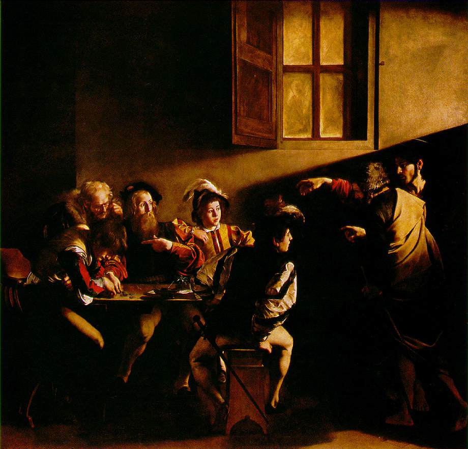 |
| The Calling of Saint Matthew Caravaggio, Public domain, via Wikimedia Commons |
In The Calling of Saint Matthew, light streams diagonally into the scene, illuminating the figures selectively. The juxtaposition between darkness and light not only organizes the composition but conveys spiritual significance, symbolizing divine intervention in the ordinary world.
The contrast between the shadowy tavern and the glowing hand of Christ elevates the narrative power of the painting.
Caravaggio further juxtaposes the sacred and the profane. The tax collectors, dressed in contemporary clothing, occupy a gritty, everyday setting, while Christ enters with quiet radiance. The illumination itself functions symbolically: Christ is not the brightest figure, yet the light points toward Matthew, suggesting inner awakening rather than external spectacle. The starkness of Caravaggio’s light against enveloping darkness creates an unforgettable tension—juxtaposition as both a visual and theological device.
7. “Woman with a Parasol” by Claude Monet (1875)
 |
| Woman with a Parasol— Madame Monet and Her Son Claude Monet, Public domain, via Wikimedia Commons |
Monet again demonstrates the power of juxtaposition in Woman with a Parasol. The bright whites of the dress and parasol are set against the swirling blues and greens of the sky and grass.
The juxtaposition of cool and warm shades, of figure and environment, creates movement and liveliness. This use of juxtaposition reflects the fleeting beauty of a moment, central to the Impressionist vision.
Monet’s brushwork is also a form of juxtaposition. Short, flickering strokes of green and blue in the grass vibrate against the whites of the dress, suggesting wind and motion. The parasol shades the woman’s face, setting light against shadow in miniature.
Unlike the heavy contrasts of Caravaggio, Monet’s juxtaposition is gentle, atmospheric, yet equally effective in stirring perception. This shows that juxtaposition need not always be dramatic—it can also be subtle and lyrical.
Historical Evolution of Juxtaposition in Painting
While juxtaposition has always been present in art, its emphasis has shifted according to the priorities of different artistic movements. Each era adopted its own way of setting opposites against one another, reflecting broader cultural, philosophical, and political concerns.
Renaissance: Artists like Leonardo da Vinci refined the use of tonal contrast and atmospheric perspective to juxtapose clarity with haziness, thereby creating a convincing sense of depth. In works such as The Last Supper (1495–1498), Leonardo placed luminous figures against receding shadows, while distant landscapes blurred into a soft haze. This technique emphasized not only spatial recession but also symbolic layers—human clarity set against divine mystery. Juxtaposition here was subtle, a tool of harmony and balance that supported the ideals of rationality and order central to Renaissance thought.
Baroque: By contrast, Baroque painters embraced extremes. Caravaggio’s dramatic chiaroscuro thrust figures into blinding light against enveloping darkness, generating tension and intensity. In paintings like The Conversion of Saint Paul (1600–1601), the stark interplay of light and shadow communicated spiritual struggle and divine revelation. Juxtaposition during this era was theatrical and emotional, reflecting the Counter-Reformation’s desire to move audiences through awe and drama. Where Renaissance artists sought equilibrium, Baroque painters pursued contrast as a way to shock and stir the soul.
 |
| Oath of the Horatii (1784) Anne-Louis Girodet de Roussy-Trioson, Public domain, via Wikimedia Commons |
Neoclassicism: In the late 18th century, Neoclassical artists such as Jacques-Louis David adopted a different form of juxtaposition, one rooted in clarity and moral gravity.
David’s Oath of the Horatii (1784) set rigid geometry and stark compositional simplicity against the emotional turmoil of his subjects.
His contrasts were not just visual but ideological: order versus chaos, civic duty versus personal desire. Neoclassical juxtaposition was austere, designed to strip away excess and elevate political and ethical ideals.
 |
| The Third of May 1808, Francisco Goya, Public domain, via Wikimedia Commons |
Romanticism: In the early 19th century, Romantic artists pushed against Neoclassicism’s restraint, embracing instead the juxtaposition of wild nature with human vulnerability.
Francisco Goya, in works like The Third of May 1808 (1814), contrasted the cold rigidity of soldiers with the desperate humanity of civilians, turning political violence into a timeless meditation on suffering.
Meanwhile, J.M.W. Turner juxtaposed radiant light with stormy darkness in seascapes that highlighted the sublime power of nature over humankind. Romantic juxtaposition was emotional, turbulent, and often unsettling—an exploration of extremes that mirrored the era’s fascination with passion, individuality, and the uncontrollable forces of the world.
Realism: Mid-19th century Realist painters such as Gustave Courbet used juxtaposition to challenge social hierarchies. By placing laborers and peasants in the same monumental scale previously reserved for kings and saints, Courbet subverted expectations and emphasized social contrasts. Juxtaposition here became political, a way of questioning entrenched power structures and affirming the dignity of ordinary life.
Impressionism and Post-Impressionism: Impressionists employed juxtaposition primarily through color. Artists like Claude Monet set warm and cool tones side by side to capture fleeting atmospheric effects. Post-Impressionists went further: Paul Cézanne juxtaposed structured brushstrokes with shifting perspectives, while Vincent van Gogh used complementary colors to intensify emotional resonance. These painters transformed juxtaposition into a language of perception and feeling, marking a transition toward modern abstraction.
Modernism and Beyond: In the 20th century, juxtaposition expanded into bold experimentation. Cubists such as Pablo Picasso fractured space, juxtaposing multiple perspectives of the same object within a single canvas. Surrealists like Salvador Dalí juxtaposed dreamlike imagery with hyper-realistic detail, creating uncanny worlds where logic collapsed. Abstract Expressionists such as Mark Rothko juxtaposed vast fields of luminous and somber color to evoke spiritual and emotional states. In contemporary art, juxtaposition remains central—whether in Pop Art’s collision of high and low culture (Andy Warhol), or in postmodern works that place historical references alongside digital imagery.
From the Renaissance to today, the evolution of juxtaposition in painting reflects changing ideas about truth, beauty, society, and the human condition. What began as a tool for depth and harmony became, over time, a means of drama, critique, and innovation. Each movement reinterpreted the power of placing opposites side by side, reminding us that contrast is not only visual but also philosophical.
|
| Oath of the Horatii (1784) Anne-Louis Girodet de Roussy-Trioson, Public domain, via Wikimedia Commons |
Juxtaposition is one of the most vital techniques in the art of painting, enabling artists to create striking visual tension, harmony, and meaning by placing contrasting elements side by side.
This essay explores the multifaceted role of juxtaposition, focusing particularly on color, light, texture, and symbolic oppositions.
From the dissonant greens and reds in Vincent van Gogh’s The Night Café to the luminous interplay of light and shadow in Caravaggio’s The Calling of Saint Matthew, artists across history have used juxtaposition to heighten emotion and deepen interpretation.
Claude Monet’s Impression, Sunrise and Woman with a Parasol demonstrate how Impressionism employed subtle contrasts of warm and cool tones to capture fleeting beauty, while Salvador Dalí’s The Persistence of Memory juxtaposes dream and reality through surreal contrasts of form and color. Edvard Munch’s The Scream epitomizes emotional juxtaposition, while Jacques-Louis David’s The Death of Marat underscores political and symbolic contrasts. By examining these masterpieces, this essay reveals how juxtaposition has shaped art across centuries, proving itself a timeless and transformative tool in painting.