Edgar Degas: Landscapes of Memory and Rare Visions of Nature

Self-portrait 1863
Edgar Degas, Public domain,
via Wikimedia Commons
INTRODUCTION

When most people hear the name Edgar Degas, they picture dancers in rehearsal rooms, milliners bent over hats, women at their toilette, or racehorses in restless motion. 

The artist’s association with ballet and the modern life of Paris is so strong that it often eclipses another important, though smaller, dimension of his practice: landscape painting

While Degas never produced landscapes in the systematic way of Claude Monet or Camille Pissarro, he nonetheless experimented with the genre at several moments in his career. 

His landscapes, particularly those made in the 1890s, stand apart as luminous explorations of memory, mood, and color rather than straightforward depictions of nature.

This essay offers a comprehensive narration of Degas’s landscape paintings, focusing on five significant works, while also situating them beside two comparable examples from other artists. We will explore Degas’s color schemes, his choice of subjects, the locations where these works are housed, and the way they have been valued by collectors, museums, and the art market. In the process, we’ll see how even an artist so strongly linked to the bustle of modern Paris managed to capture the solitude and timelessness of the natural world.

Degas and the Turn Toward Landscape

Degas began his career as a draftsman and history painter, absorbing classical training at the École des Beaux-Arts and in Italy. By the 1860s, he joined with the Impressionist circle, although he always remained apart—preferring to call himself a “realist” or “independent.” Unlike Monet, who embraced plein air practice, Degas worked almost exclusively in the studio, relying on sketches, memory, and imagination. This distinction shaped his approach to landscape: he was not concerned with capturing the instantaneous light of an outdoor scene but with reconstructing its emotional resonance.

During the late 19th century, especially the 1890s, Degas produced a series of landscape monotypes and pastels that feel dreamlike, as if half-remembered visions. He sometimes used a technique of printing a monotype—a kind of single-print engraving with ink—and then overlaying it with pastel, creating shimmering, mysterious surfaces. These works are deeply different from Impressionist plein-air canvases; they seem to arise from memory, atmosphere, and the subconscious, foreshadowing Symbolism and even modern abstraction.

Degas’s Color Scheme in Landscapes

In his landscapes, Degas employed a strikingly different palette than in his ballet interiors. His colors are intensely layered, atmospheric, and often otherworldly:

  • Deep violets, indigos, and blues dominate skies and shadowed terrains.

  • Rusty oranges, siennas, and ochres pulse in earth and shoreline scenes, creating warmth that vibrates against cool tones.

  • Acid greens and turquoises shimmer in meadows or trees, used more for emotional punch than natural fidelity.

  • Silvery grays appear in foggy horizons or twilight fields.

  • Pastel overlays give his surfaces a hazy, dreamlike softness, dissolving edges and leaving shapes to hover between abstraction and description.

Unlike Monet’s calibrated color to register fleeting daylight, Degas’s hues are psychological—they evoke moods of isolation, melancholy, or mystery. His landscapes can appear both vibrant and somber, like memories fading yet glowing at the same time.

Five Major Landscape Paintings by Degas

1. Landscape with Rocks (c. 1892)

This work demonstrates Degas’s fascination with geological forms and rough terrain. Painted in monotype with pastel additions, the scene presents a rocky outcrop glowing with orange and red, while the surrounding ground sinks into deep green. The sky is not detailed but suggested by a pale wash. The composition feels monumental, as if the rocks themselves are characters. Degas uses bold strokes, fusing abstraction with geology, and the result is an uncanny scene of nature remembered through emotion rather than sight.

Where it is displayed: Today, this work resides in a major New York collection devoted to modern and contemporary masters.
Value: As one of Degas’s late landscapes, it is highly prized because of its rarity; landscapes form only a small fraction of his oeuvre, which makes them particularly attractive to collectors.

Landscape with Chimney Smoke - Pastel
Edgar Degas, Public domain, via Wikimedia Commons
2. Landscape with Smokestacks (c. 1890)

This piece balances Degas’s interest in modern industry with natural setting. The foreground consists of darkened earth, while beyond rise faint smokestacks sending plumes into a red-and-violet sky. 

The entire work blends memory and imagination—perhaps reflecting Degas’s recollections of northern France’s industrial countryside. The palette is dusky and fiery at once, dominated by reds and blacks.

Interpretation: This landscape offers a sharp contrast to Impressionist serenity. Instead of fleeting light on haystacks, Degas delivers a brooding meditation on industrial encroachment and memory.
Where displayed: The painting belongs to an American collection.
Value: Its combination of industrial subject matter and Degas’s pastel layering makes it a rarity, pushing its cultural value upward.

3. Landscape with Trees (c. 1890–92)

This work exemplifies Degas’s reliance on color harmonies. The trees stand almost like silhouettes, their trunks black against a golden-orange sky. The ground is a symphony of rust and green tones, while the sky radiates with a glow reminiscent of sunset. The painting has less descriptive detail than a traditional landscape; instead, it is charged with rhythm and atmosphere, almost like a visual poem.

Where displayed: This painting is preserved in a major museum in Paris, forming part of a national collection.
Value: Because of its experimental technique, it is often considered closer to Symbolism, which enhances its scholarly and financial importance.

4. Landscape with Lake (c. 1892)

This monotype with pastel overlays captures a still body of water bordered by rolling hills. The lake glimmers in pale turquoise and silver, while the land is mottled with browns and deep greens. The sky is rendered in soft gray tones that suggest mist or dawn light. The entire scene is infused with silence and calm—rare qualities in Degas’s usually bustling art.

Interpretation: Critics have remarked that this lake scene seems almost Japanese in its simplicity, revealing how Degas absorbed influences beyond France.
Where displayed: A European collection, well known for Impressionist holdings, currently houses this piece.
Value: It appeals to both collectors of Impressionism and those intrigued by the transition toward abstraction.

5. Landscape in the Mountains (c. 1890s)

This work emphasizes vertical thrust: dark peaks rise against a turbulent sky. Degas’s use of indigo, violet, and flashes of orange creates a sense of storm and power. The brushwork—or rather, pastel strokes—conveys the energy of geological upheaval. The piece is less pastoral and more sublime, recalling Romantic depictions of nature’s grandeur but filtered through Degas’s memory-driven process.
Where displayed: The painting is part of an American collection with a strong emphasis on Impressionist and post-Impressionist art.
Value: This landscape is valued for its intensity and its closeness to modern abstraction; scholars often highlight it as an example of Degas’s late experimentation.

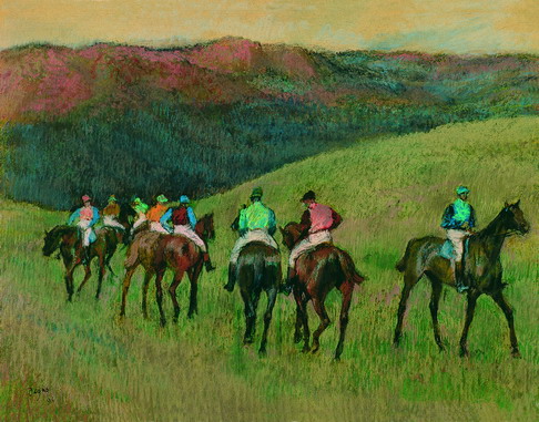
Race Horses in a Landscape  1894
Edgar Degas, Public domain, via Wikimedia Commons
Degas’s Choice of Subjects in Landscapes

Unlike Monet or Sisley, who painted rivers, gardens, and towns with consistent fidelity, Degas rarely focused on a single identifiable place. Instead, his landscapes are composite visions—part memory, part invention. His subjects include:

  • Rock formations and mountains (symbolic of permanence and strength).

  • Industrial elements (smokestacks, distant factories, recalling the modern intrusion into nature).

  • Lakes and meadows (rendered in soft, dreamy tones).

  • Trees silhouetted against skies (reduced almost to calligraphic symbols).

By working from memory, Degas transformed natural scenes into psychological landscapes. They are less “records of places” than landscapes of mind, infused with personal solitude, aging, and perhaps nostalgia.

Where Degas’s Landscapes Are Displayed Today

Because Degas produced relatively few landscapes compared to his ballet and portrait works, each surviving piece has special prominence in the institutions that own them. His landscapes can be found in:

  • Major Paris museums, where several monotypes and pastels reside.

  • American collections in New York, Boston, and Chicago, which preserve some of his most experimental landscapes.

  • European holdings, including London and Swiss collections, which showcase late works.

Visitors to these museums often find Degas’s landscapes tucked among his more famous dancers, making them feel like hidden treasures waiting to be discovered.

Valuation of Degas’s Landscapes

In the art market, Degas’s landscapes are rare and highly coveted. While his ballerina pastels and sculptures dominate auction headlines, the landscapes hold a special appeal for advanced collectors and museums because they represent his experimental side.

  • Auction records for Degas landscapes have reached millions, especially when works combine monotype and pastel.

  • Smaller sketches or studies still command strong six-figure sums.

  • Provenance plays a major role; landscapes that belonged to Degas’s contemporaries or appeared in early exhibitions are especially valued.

Beyond financial valuation, scholars see these landscapes as vital in understanding the late 19th-century shift from realism toward abstraction. In this sense, their intellectual and cultural worth far surpasses their relative rarity.

Two Similar Landscapes by Other Artists

To better understand Degas’s unique path, it is useful to compare his landscapes with those of two other artists—one Impressionist peer and one earlier Romantic.

Haystacks at sunset
Claude Monet, Public domain, via Wikimedia Commons
1. Claude Monet, Haystacks at Sunset (1891)

Monet’s haystack series, with their shifting colors under different light conditions, provide a foil to Degas. 

Where Monet worked outdoors to capture ephemeral daylight, Degas worked indoors from memory, creating timeless and dreamlike visions

Monet’s palette—pure yellows, violets, blues—shares some similarities, but Monet’s colors describe nature’s actuality while Degas’s evoke interior states.

Both artists, however, share a fascination with how color itself can carry emotion.
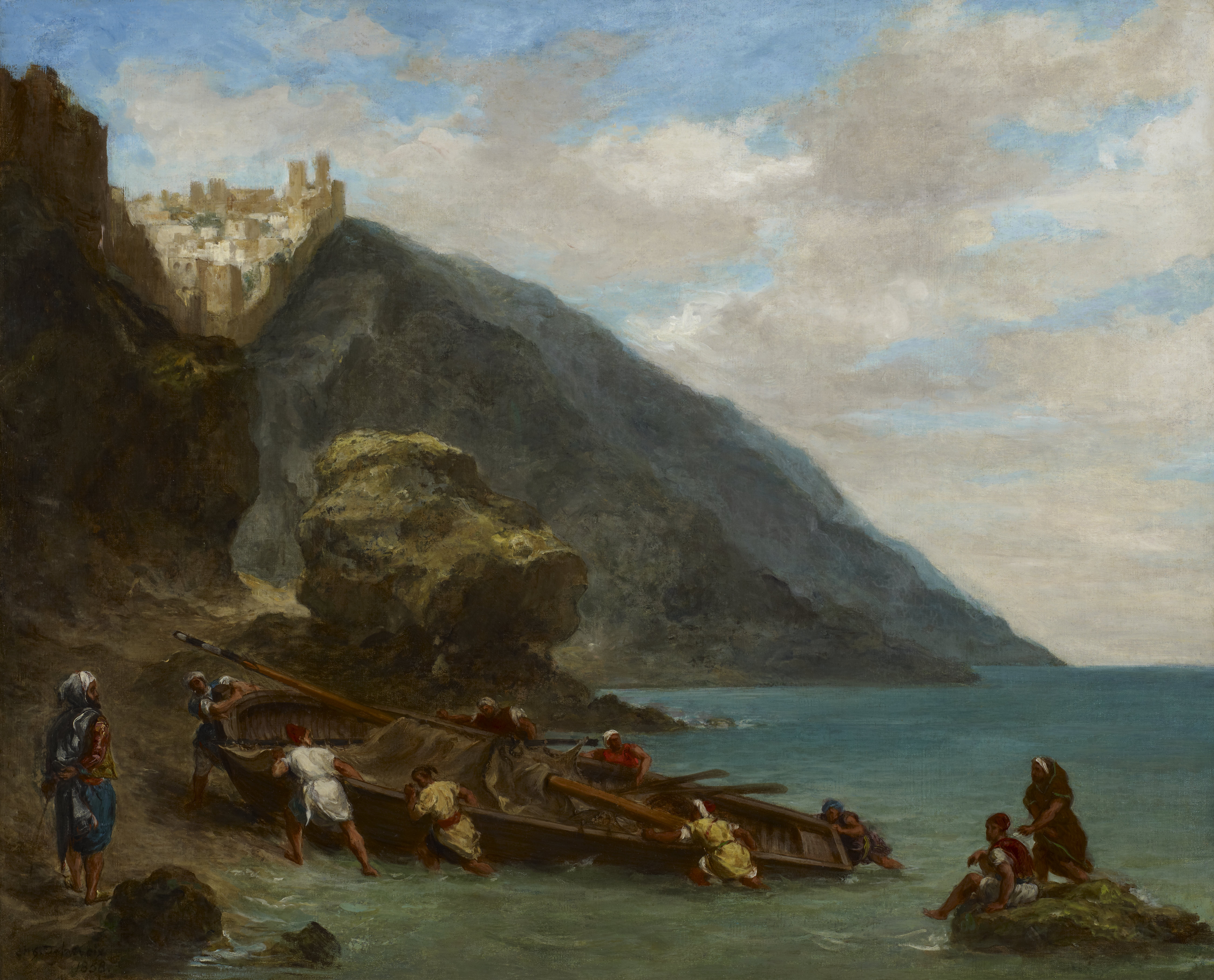
View of Tangier 
Eugène Delacroix, Public domain, via Wikimedia Commons
2. Eugène Delacroix, View of Tangier (1856)

Delacroix’s North African landscapes, filled with vibrant contrasts of blue sky and red earth, anticipate Degas’s bold chromaticism. 

Delacroix infused landscape with passion and exotic mood rather than strict description, just as Degas later infused his own landscapes with memory and emotion. 

This Romantic heritage helps situate Degas not just within Impressionism but within a longer lineage of expressive landscape painting.

Guide to Degas’s Landscapes

  • Edgar Degas landscape paintings are rare but crucial to understanding his versatility.

  • Degas’s color palette in landscapes includes deep violets, oranges, greens, and silvers, layered in pastel.

  • Major works include Landscape with Rocks, Landscape with Smokestacks, Landscape with Trees, Landscape with Lake, and Landscape in the Mountains.

  • Subjects range from geological forms to industrial motifs, often imagined from memory.

  • Where to see Degas landscapes: Paris, New York, Boston, Chicago, and London collections.

  • Value of Degas’s landscapes: Rare at auction, they command millions when sold, prized for their scarcity and experimentation.

  • Comparison with Monet and Delacroix: Monet sought light’s fleeting moments; Delacroix sought passion; Degas fused memory and imaginationConclusion: Degas’s Landscapes as Inner Worlds

Edgar Degas may forever be associated with dancers bending and spinning under studio lights, but his landscapes form a quieter, haunting chapter of his oeuvre. They are not records of nature in the Impressionist sense but visions shaped by memory, color, and solitude. His palette of violets, oranges, and misty greens evokes not just what a place looks like but how it feels to recall it.

Whether we look at Landscape with Rocks glowing like embers, or Landscape with Lake shimmering in silvery quiet, or Landscape with Smokestacks brooding over industrial skies, we find an artist who translated the natural world into an emotional theater of color.

Today, Degas’s landscapes are preserved in major collections, studied as harbingers of abstraction, and valued both financially and culturally for their rarity. Seen beside Monet’s haystacks or Delacroix’s exotic scenes, they reveal how Degas forged his own path: not light observed directly, but landscape remembered, dreamed, and transformed into art’s enduring mystery.

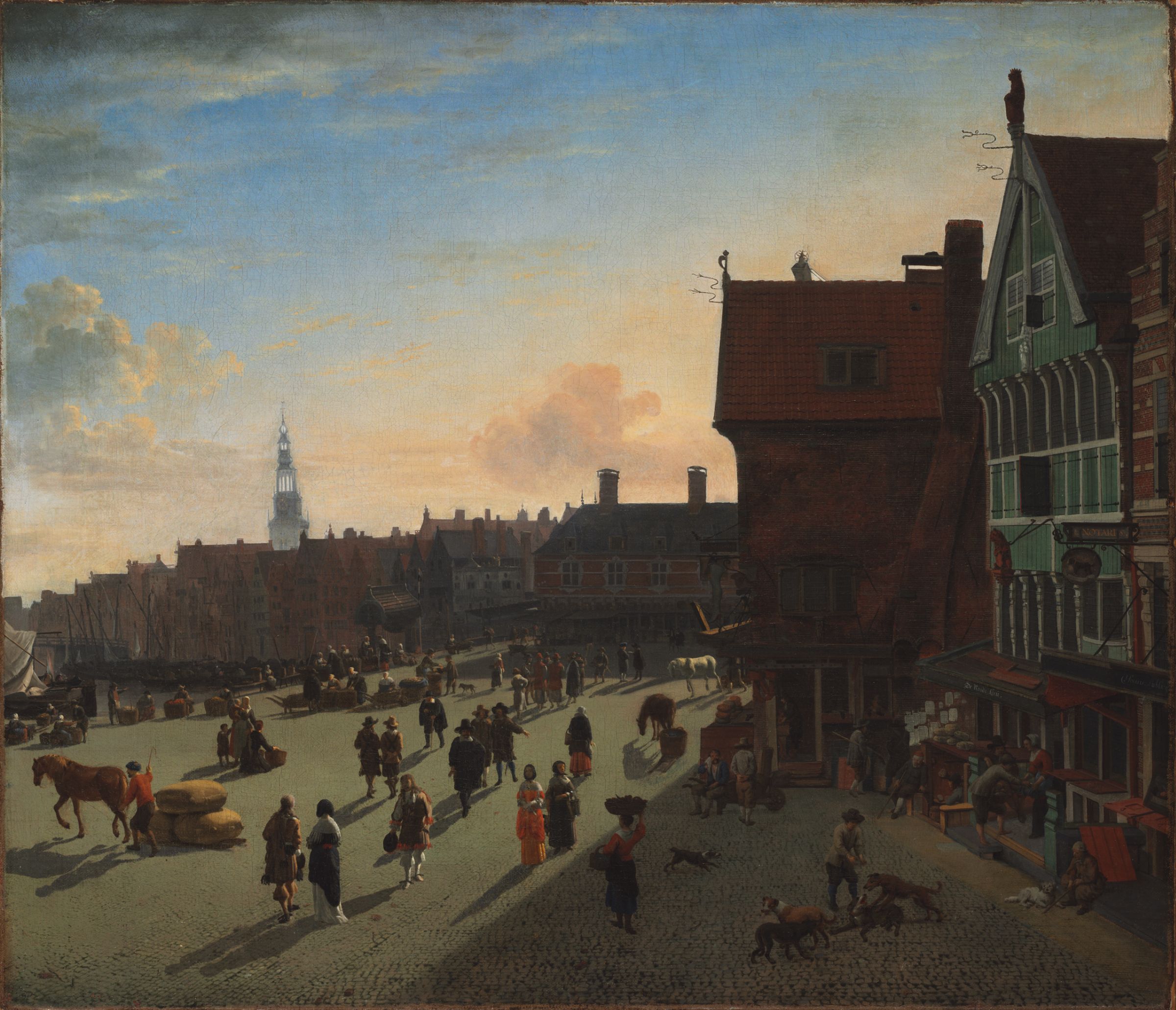
Heyden: Painting Urban Architecture and Townscapes

The Grounds of a Baroque Palace
Jan van der Heyden, Public domain, via Wikimedia Commons
INTRODUCTION

Jan van der Heyden (1637–1712) is one of the Dutch Golden Age’s most celebrated painters of urban architecture and townscapes. 

Trained as a painter and inventor (he improved firefighting equipment and hydraulic devices), van der Heyden translated the hard geometry of city buildings, canals, and bridges into paintings that balance documentary clarity with a quietly staged human drama.

His works are valued today both for their technical finish and for the window they provide onto 17th-century urban life. This essay examines five key paintings, compares van der Heyden’s approach with two similar works by other artists, and analyzes his color palette, recurring subjects, present display locations, and typical market valuations.

Five key paintings

The Dam and Damrak, Amsterdam
Jan van der Heyden, Public domain, via Wikimedia Commons

1. The Dam and Damrak, Amsterdam (c. 1663)

This view captures one of Amsterdam’s principal civic axes—the Dam and the Damrak—from a slightly unusual vantage point that concentrates on everyday activity along the water. 

The composition demonstrates van der Heyden’s characteristic combination of measured architectural perspective, crisp drawing of façades, and the animated human vignettes at canal level: boats, merchants, and passersby who populate the city. 

The work’s careful depiction of reflections in the water and the fine detail on gables reveal his patience of observation.

Why it matters: the painting is both a topographical record and a crafted composition—van der Heyden rearranges and compresses views for pictorial effect while retaining documentary clarity.

2. Amsterdam City View with Houses on the Herengracht and the Old Haarlemmersluis (c. 1670)

This piece shows van der Heyden’s interest in the interplay between canals, locks, and contiguous housefronts. The scene is notable for its hybrid character: while topographically accurate in parts, the artist recombines structures to create an idealized city stretch that foregrounds aligned façades and the engineered hydraulics of the lock. The painting highlights his handling of a close-up urban perspective—the viewer almost stands at the waterline—and his layering of small staffage (figures and boats) to animate the scene.

Why it matters: it exemplifies van der Heyden’s skill at compressing real architectural elements into cohesive vistas that serve both topography and pictorial order.

3. The Herengracht, Amsterdam, Viewed from the Leliegracht (c. 1660–1670)

Here van der Heyden turns his attention to one of Amsterdam’s most prestigious canals, the Herengracht. The vantage point from the Leliegracht yields a layered, receding composition of housefronts and bridges, with the canal acting as a reflective axis. The painting foregrounds van der Heyden’s hallmark: sharply delineated architectural lines rendered with thin, precise brushwork, paired with lively small-scale human activities—fishermen, pedestrians, and domestic boats.

Why it matters: it is a representative example of the artist’s mature canal views, demonstrating an economy of means and a focus on urban texture.

4. Dam Square, Amsterdam (c. 1668)

Van der Heyden’s view of the Dam Square concentrates on the civic heart of Amsterdam, its market life, and its monuments. 

The painting captures the dignity of public architecture and the hustle of civic spaces: market stalls, carriages, and citizens moving across the square. 

As in his other works, a calm, almost editorial eye organizes significant architectural features into a readable, rhythmically balanced composition.

Why it matters: it places van der Heyden among the best of Dutch townscape painters who could turn civic architecture into narrative stage sets without sacrificing topographical interest.

View of the Westerkerk, Amsterdam
Jan van der Heyden, Public domain, via Wikimedia Commons
5. View of the Herengracht, Amsterdam (c. 1670—private or circulating collection)

Another iteration of the Herengracht motif, this painting emphasizes the long sweep of the canal, the rhythm of gables, and the carefully modeled reflections. 

It is an excellent example of the variants van der Heyden painted of similar locations—each variant tweaks perspective, light, or staffage to produce a distinct atmosphere. Many such works reside today in private collections or travel through the auction market.

Why it matters: it shows how van der Heyden repeatedly returned to the same motifs as if to study permutations of light, composition, and civic life over time.

Two comparative works by other artists

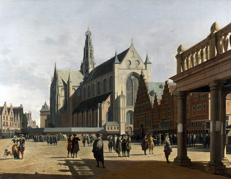
Market Place and Grote Kerk at Haarlem {{PD-US}} 
Gerrit Berckheyde, Public domain, via Wikimedia Commons
A. Gerrit Berckheyde—The Market Place and the Grote Kerk at Haarlem (1674)

Gerrit Berckheyde, a near-contemporary, specialized in luminous views of provincial Dutch towns (notably Haarlem). 

His Market Place and the Grote Kerk at Haarlem share van der Heyden’s interest in civic architecture and humanized public squares. 

However, Berckheyde often employs a warmer, sunlit palette and emphasizes open-air atmosphere and monumental church façades, while van der Heyden typically focuses on complex canal perspectives, crisp linearity, and a cooler, more restrained light.

A Grand Canal View
Canaletto, Public domain, via Wikimedia Commons
B. Canaletto—a Grand Canal view (18th century)

Canaletto’s Venetian vedute present an instructive contrast. Like van der Heyden, Canaletto is a master of architectural precision and of composing waterborne reflections and human figures. 

However, Canaletto’s light is Mediterranean and often theatrical; his scale tends toward panoramic, and his vedute were made for a Grand Tour market that prized recognizable monuments. Van der Heyden’s townscapes are more intimate and infrastructural: canals, locks, and bridges rather than grand palaces and piazzas.

Color palette and technique

Palette

Van der Heyden’s palette is characteristically cool and restrained, derived from the northern European daylight: ultramarine (or azurite substitutes), lead white, earth tones (ochres and umbers), and restrained greens for foliage and canal water. His skies are often pale, layered with thin glazes to achieve subtle gradations; architecture is modeled with clean, near-dry brushwork that emphasizes edges and geometry rather than painterly texture. Highlights—window glints, boat hulls, and gilded architectural details—are added with a precise hand, usually in a warmer white or pale yellow to create contrast.

Brushwork and layering

Technically, van der Heyden favors thin, exact strokes and careful underdrawing. He often painted on wood panels or fine canvases with an initial ground that allowed crisp line work. Finishing touches are delicate: small human figures are often painted with a few economical strokes, while architectural ornament receives minute attention. The result is a surface where line and plane dominate over painterly impasto—a measured, almost draughtsman-like approach that echoes his interest in precision and engineering.

Subjects and recurring motifs

  • Canals and locks

  • Housefronts and gables

  • Reflections and waterborne activity

  • Small staffage

  • Civic centers

These motifs reinforce van der Heyden’s dual impulse: the desire to document and the desire to compose. He often edited reality to improve legibility, sometimes moving buildings or recombining elements to create a more balanced picture.

Where these works are displayed today

  • The Dam and Damrak, Amsterdam—held in a prominent museum collection.

  • Amsterdam City View with Houses on the Herengracht and the old Haarlemmersluis—in a major national collection.

  • The Herengracht, Amsterdam, Viewed from the Leliegracht—part of a large European painting collection in Los Angeles.

  • Dam Square, Amsterdam—preserved in a municipal or historical collection.

  • View of the Herengracht, Amsterdam—examples are found in both public and private collections.

Note: Museum holdings rotate; not all works are permanently on view.

Valuations and market behavior

  • Auction prices: smaller works and uncertain attributions sell at modest prices, while fully attributed, well-provenanced townscapes can reach mid-five-figure to six-figure results.

  • Value drivers: secure attribution, condition, appealing subjects (major Amsterdam views), and provenance.

  • Market variability: not as stratospheric as Rembrandt or Vermeer, but consistently desirable among collectors of townscapes.

How to evaluate a Jan van der Heyden painting

  1. Provenance

  2. Attribution

  3. Condition

  4. Subject and rarity

  5. Documentation

Final assessment

Van der Heyden combined an engineer’s eye with a painter’s craft. His topographical accuracy, balanced by compositional invention, created townscapes that are both historical documents and works of art. Compared with Berckheyde and Canaletto, he stands out for his cooler palette, infrastructural focus, and documentary impulse. His works remain valuable to museums and collectors alike, with steady demand on the art market.

Keywords: Jan van der Heyden paintings, Dutch Golden Age townscapes, Herengracht, Damrak, Amsterdam city view, art valuation, museum locations, color palette, architectural painting

“George Washington at Princeton” by Charles Willson Peale: A Portrait of Leadership

Introduction: Why this painting still matters

George Washington at Princeton
Charles Willson Peale, Public domain,
 via Wikimedia Commons

Among the many images that have shaped the public memory of America’s first president, Charles Willson Peale’s “George Washington at Princeton” (1779) stands out for its gripping immediacy and carefully staged symbolism. Painted in the wake of the Continental Army’s crucial victories at Trenton and Princeton, the canvas offers far more than a likeness. 

It is a statecraft image—an early American masterclass in how portraiture can narrate a nation’s ideals while celebrating a single leader. If you’re researching George Washington portraits, the Peale Princeton portrait is a cornerstone: it fuses battlefield reportage with classical codes of heroism, and it fixed Washington’s public image at a turning point of the war.

This essay explains the painting’s historical context and visual program, unpacks Peale’s artistic methods, and then compares the work with two other landmark Washington portraits by different artists. Along the way you’ll find insights useful for students of American art, museum-goers, and anyone exploring American Revolutionary portraiture for deeper meaning and visual storytelling.

The historical moment: Victory, vulnerability, and image-making

Peale completed the “George Washington at Princeton” after the daring winter campaign of 1776–1777, when Washington’s army executed the surprise crossing of the Delaware, won at Trenton (December 26, 1776), and followed with victory at Princeton (January 3, 1777)

These wins didn’t end the war, but they dramatically reversed momentum, rallying colonial morale and demonstrating Washington’s tactical nerve. By 1779, when Peale painted the full-length portrait, public appetite for a formal image of the commander had grown intense. The goal wasn’t simply to record Washington’s face; it was to codify leadership—resolve under pressure, dignified restraint, and the promise of republican governance.

Peale, a veteran himself who served with the Pennsylvania militia, understood that portraiture could function like a battlefield dispatch. He designed the composition as a visual proof of concept: Washington is shown as the axis around which turmoil becomes order, chance turns into strategy, and a scattered militia coheres into a national army.

George Washington at Princeton
Charles Willson Peale, Public domain,
 via Wikimedia Commons

First look: What you see in the painting

Stand before the canvas and the story organizes itself quickly:

  • Washington stands full-length, in blue and buff commander’s uniform, the cloak draped with an effortless authority that suggests poise, not pomp.

  • He places one arm across a cannon, a stabilizing diagonal that doubles as a symbol of command over artillery and the broader machinery of war.

  • At his feet or to the side appear captured British flags—trophies that visually certify the Princeton victory.

  • In the distance, you’ll recognize Nassau Hall, the principal building at Princeton, which briefly served as British headquarters and then witnessed their retreat. A flag flying above it signals the reclaimed ground.

  • A horse and groom appear off to one side, a small but vital subplot grounded in lived logistics: the general’s mobility, the equestrian discipline of command, and the unseen labor that sustains an army in the field. Many viewers recognize this figure as Washington’s enslaved valet, William Lee, who frequently appears in Revolutionary-era imagery and reminds us that the fight for liberty coexisted with systems of unfreedom.

Peale’s stagecraft is deliberate: foreground certainties (the general, the cannon, the captured standards) counterbalance background contingencies (smoke, moving troops, unsettled skies). The composition reads like a military sentence: subject (Washington) + verb (commands) + object (victory at Princeton).

Artistic specialties: How Peale builds leadership with paint

1) The full-length formula, Americanized

Full-length portraiture was traditionally reserved for princes, aristocrats, and grandees. Peale uses the format without the feudal trappings. Washington is elevated by scale and stance, yes, but the ornaments of court portraiture—gilt columns, velvet canopies, allegorical putti—are replaced with field-tested realities: mud, cannon, and weather. That pragmatic substitution is the American twist: grandeur through service, status through duty.

2) Uniform color and meaning

The blue coat with buff facings—associated with the Continental Army’s commanding officers—does heavy symbolic lifting. Blue signals steadiness and republican virtue; buff, with its warmer tone, acts as a foil that keeps the figure audible amid the stormy palette of the background. Peale’s brush organizes these colors into a readable silhouette, so Washington’s authority remains legible even at a distance.

George Washington at Princeton
Charles Willson Peale, Public domain,
 via Wikimedia Commons

3) Anatomy of the pose

Washington’s weight distribution—one leg forward, the torso turned slightly—creates a controlled contrapposto. In classical sculpture that stance conveys calm readiness, and Peale adapts it here to say: prepared, not precarious. The hand resting on the cannon is both composition and character: the general doesn’t clutch or brandish; he anchors.

4) Face as a weather report

Peale suppresses theatrical expression in favor of temperate seriousness. The eyes scan slightly beyond the viewer’s left, as if contemplating orders rather than savoring triumph. The result is republican gravitas: personal emotion subordinate to public responsibility.

5) Battlefield still life

The cannon, rammer, wheel hub, and flagpoles function as a mini-gallery of circular and diagonal forms that aim back toward the figure. This “gear cluster” is not random detail; it’s Peale’s way of architecting attention. Every angled spear and wheel spoke points to Washington’s steadiness—technology in service of temperament.

6) Atmospheric storytelling

The sky’s smoke-toned turbulence tucks narrative into the background without stealing the foreground. Peale modulates value (light/dark) so that the figure remains the brightest and most stable zone, a lighthouse in martial weather. The painter’s control of atmosphere suggests what Washington’s generalship promised the public: clarity cutting through confusion.

7) Human infrastructure

The horse and groom compress the logistics of command to a single vignette. The horse implies kinetic capacity. The groom—often read as William Lee—signals dependence on a wider network of labor, including enslaved labor, without which the Continental Army’s daily operations would have been impossible. Peale does not sermonize but includes the truth in the frame.

Peale’s method: Soldier-painter as image engineer

Charles Willson Peale was not merely a portraitist on commission; he participated in the Revolutionary moment intimately. That closeness shaped his likeness discipline. He had sketched Washington from life multiple times and knew the general’s features well. When Peale scales up to the monumental Princeton canvas, he combines observational accuracy with allegorical composition—a hybrid method typical of artists who understood both European portrait conventions and American political needs.

Technically, Peale works with a controlled palette and layered glazes that produce durable, high-value contrasts. He was also an organizer and museum founder later in life, keenly aware that images educate. The Princeton portrait is constructed like a public classroom: anyone can “read” the narrative quickly, yet the longer you look, the more interlocking symbols you notice.

What the painting says about leadership

  1. Victory is verified, not vaunted. The captured flags and distant Nassau Hall are receipts, not boast. Washington doesn’t gloat; he governs his composure.

  2. Power is procedural. The general’s hand on the cannon is cool, not dramatic. Authority is shown as stability, the ability to align tools, people, and time.

  3. Republic over royalty. Peale borrows the scale of court portraiture but rejects its ornamental logic. Washington’s nobility is ethical, not hereditary.

  4. Liberty’s contradictions are present. The likely inclusion of William Lee is a quiet acknowledgment that the Revolution’s ideals were aspirational and uneven, shadowed by slavery and dependency. The painting is honest enough to keep that complexity inside the hero frame.

Comparing Peale’s Washington with two other iconic portraits by different artists

To appreciate the specificity of “George Washington at Princeton,” it helps to place it beside two seminal portraits by other artists. Each captures a different facet of Washington’s public identity—and each uses a distinct visual grammar.

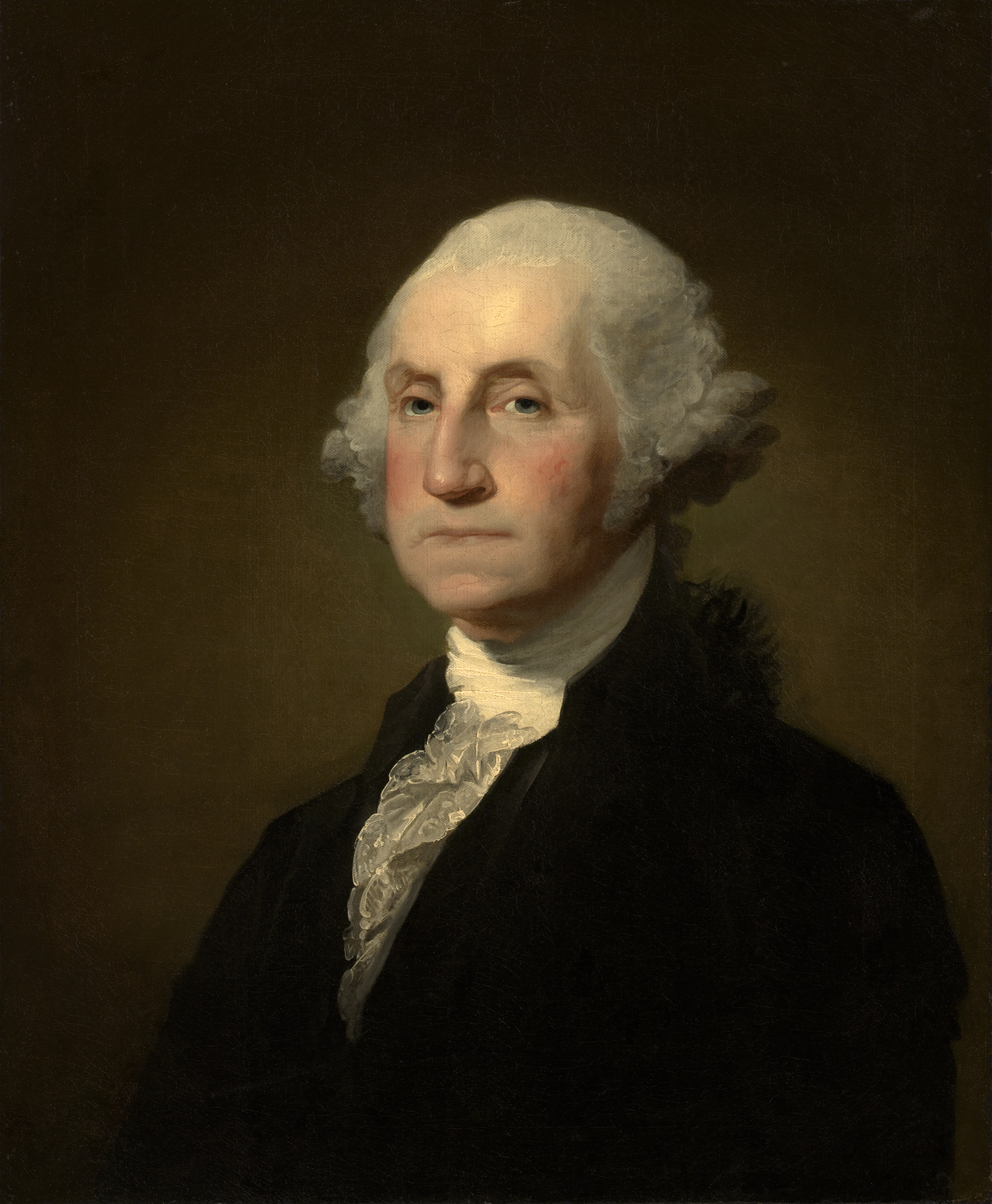
George Washington 
Gilbert Stuart, Public domain, via Wikimedia Commons
A) Gilbert Stuart’s “Athenaeum” portrait (1796)

What it is:
Perhaps the single most reproduced image of Washington, the Athenaeum portrait (often simply “the Stuart head”) is an unfinished bust-length likeness painted late in Washington’s life. 

Although the canvas was never completed, it served as the template for countless engravings, currency images, and classroom reproductions. Where Peale’s Washington is a full-bodied commander in the field, Stuart’s Washington is the statesman, distilled to head and upper torso.

Visual rhetoric:
Stuart’s genius resides in the mask of character—that famously imperturbable mouth, the subtle set of the jaw, the firm plane of the cheeks. Strip away battle trophies and flags, and you get psychological governance—authority that rides entirely on face, gaze, and the artist’s tonal control. If Peale orchestrates a battlefield symphony, Stuart performs a silent sonata in gray-blue and skin tones, conjuring Washington’s composure as a ceremonial object.

Lighting and finish:
Soft, north-light modeling produces flesh that feels at once corporeal and iconic. The brushwork is refined where it matters (eyes, mouth) and driftwood-loose elsewhere. That selective finish adds to the portrait’s aura: public figures are sharply resolved where the public needs certainty; everything else dissolves.

Public function:
Stuart’s image became the standard-issue head of state, perfect for reproductions, because it reduces Washington to a portable essence. If you want an icon for coins, postage, or civic architecture, you choose the Stuart head. If you want the drama of military leadership in action, you choose Peale’s Princeton.

Takeaway comparison:

  • Peale (Princeton): Narrative, kinetic, republicanized pageantry.

  • Stuart (Athenaeum): Composure, timelessness, reproducible state icon.

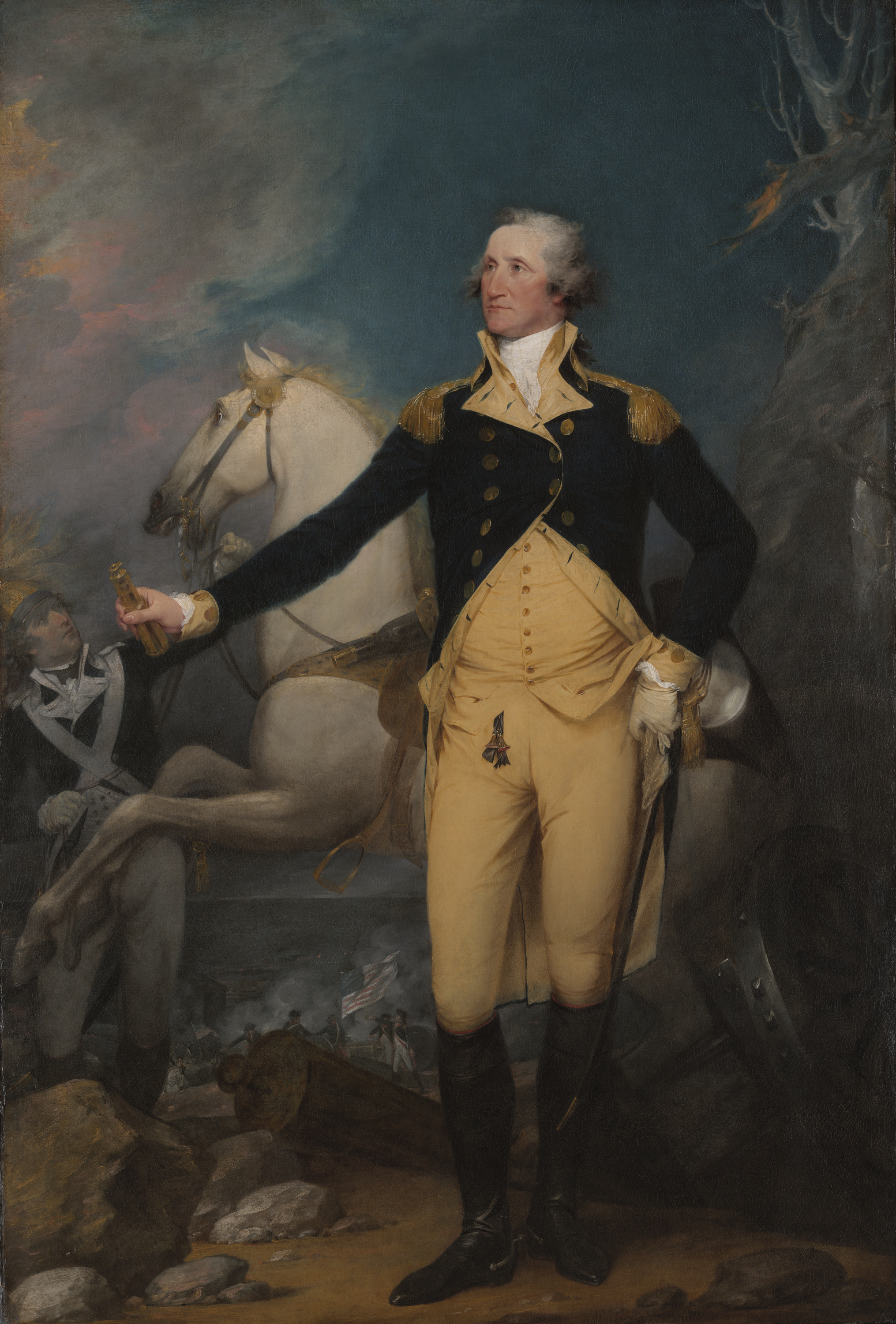
General George Washington at Trenton
John Trumbull, Public domain, via Wikimedia Commons
B) John Trumbull’s “General George Washington at Trenton” (1792)

What it is:
Painted almost two decades after the events it commemorates, Trumbull’s full-length “General George Washington at Trenton” sets the commander in a moment charged with psychological tension rather than just triumph. 

Rather than leaning on a cannon, Washington stands with a more pensive gravity, which many viewers read as the inner weather of a leader who knows the cost beneath victory.

Visual rhetoric:
Trumbull’s Washington is slim, vertical, spare. The saber and sash remain, but the cues are less about captured trophies and more about moral calculus. The atmosphere suggests a pre-dawn or post-battle hush; the figure’s face is contemplative and watchful. If Peale’s canvas says “Order drawn from chaos,” Trumbull’s implies “Burden carried with resolve.”

Palette and space:
Trumbull favors a cooler, tighter palette and more architectonic clarity around the figure, reducing the number of battlefield props. The simplification isolates Washington psychologically. Where Peale triangulates figure, cannon, and flags to ground the eye, Trumbull builds a visual pulpit—a space where Washington’s solitary duty becomes the sermon.

Public function:
If you were a young nation learning that winning a republic also means guarding it, you might gravitate toward Trumbull’s meditation. It tempers glory with governance, reminding viewers that strategy is as moral as it is martial.

Takeaway comparison:

  • Peale (Princeton): The certification of victory; Washington as the axis of order.

  • Trumbull (Trenton): The conscience of command; Washington as solitary steward.

What makes Peale’s “Princeton” the blueprint for American executive portraiture

George Washington at Princeton
Charles Willson Peale, Public domain,
 via Wikimedia Commons

Putting these three portraits in dialogue reveals why Peale’s 1779 canvas became a template for later images of American leadership:

  1. Narrative without monarchy: Peale borrows the stagecraft of European power portraits but swaps dynastic symbolism for civic evidence—flags, a public building, the technologies of war harnessed to public good.

  2. Action stabilized by character: The battlefield is kinetic; Washington is still. That contrast became a persistent American trope: the leader as the still point in a turning world.

  3. Inclusion of infrastructure: By showing the horse and groom, Peale widens the story to encompass labor, logistics, and the human network surrounding a great man. Later American art often narrows to the solitary hero; Peale’s tableau is honest about the entourage that makes victory possible.

  4. Readable at multiple distances: From across a hall, you read victory; at mid-distance, command; up close, character. The design scales, making it ideal for public spaces.

Frequently asked questions for researchers and enthusiasts

Q: When was “George Washington at Princeton” painted?
A: In 1779, several years after the actual battle (1777). The time gap allowed Peale to incorporate hindsight clarity—the victory’s significance had crystallized.

Q: Why is Nassau Hall in the background?
A: It’s a site-specific signature of the Princeton victory. Putting a recognizable building under the American banner verifies the narrative: this ground, once held by the British, is now reclaimed.

Q: Who is the groom holding the horse?
A: Many viewers interpret the figure as William Lee, Washington’s enslaved valet and an accomplished horseman who accompanied him throughout the war. Whether Lee is definitively the model, the inclusion of an African American groom underscores the complex social realities that underwrote revolutionary logistics.

Q: How many versions did Peale paint?
A: Peale painted multiple portraits of Washington, including several variants of the commander in military dress. The Princeton composition generated replicas and adaptations, attesting to its popularity and public demand.

Q: What distinguishes Peale’s brushwork from Stuart’s?
A: Peale often uses clear, descriptive forms and assertive contrasts to manage large, narrative scenes; Stuart hones subtle tonal transitions for head-and-shoulders psychology. One builds the stage, the other the face.

Visual analysis: Lines of force and the grammar of heroism

A useful way to analyze the Princeton portrait is to track the vectors. The cannon’s barrel, the staves of the captured flags, and the long diagonal of Washington’s cloak create arrows converging on the torso and face. These compositional lines reverse the chaos of battle: instead of random trajectories of musket balls and smoke, Peale draws lawful geometry—diagonals anchored by verticals (Washington’s spine and saber). Even the wheel of the artillery carriage becomes an emblem of cyclical order: history turns, but the hub holds.

Light follows the same logic. A gentle chiaroscuro lifts Washington out of the background, while the mid-tone sky prevents melodrama. The effect is neither theatrical spotlight nor diffuse haze, but a governed illumination—as if leadership itself were a kind of light regulation.

Color participates too. The cool blue of the coat, the warm buff of the facings, and the red touches in the captured colors create a patriotic triad without literal flag-waving in the figure. Peale is too sophisticated to turn Washington into a walking emblem; instead, he surrounds him with emblems resolved by character.

Ethics in the frame: Liberty’s promises and omissions

Art history isn’t merely a catalog of styles; it’s a ledger of values. The Princeton portrait carries a double-entry bookkeeping:

  • In the credit column: courage under pressure, adaptive leadership, the birth of a civic ideal that rejects hereditary privilege.

  • In the debit column: the continued presence of slavery, confronted obliquely via the groom figure; the fact that the fight for liberty proceeded alongside lives held in bondage.

Rather than condemning or celebrating, Peale records. He keeps the contradictions inside the ideal—a truthful choice that twentieth- and twenty-first-century viewers recognize as a step toward a more complete American story.

How the three portraits shape public memory

  • Peale’s “George Washington at Princeton” gives us the operational leader: order, victory, and a nation in the making.

  • Stuart’s “Athenaeum” gives us the institutional head: the calm, reproducible visage suitable for currency and officialdom.

  • Trumbull’s “General George Washington at Trenton” gives us the moral custodian: inwardness, calculation, and the burden of command.

Together they form a triptych of leadership—action, icon, conscience—that still frames how the United States pictures executive power: capable in crisis, serene in office, reflective about costs.

Key takeaways for students, curators, and enthusiasts

  1. Composition is policy. Peale’s arrangement of forms encodes a theory of governance: stability without spectacle, proof without preening.

  2. Context completes likeness. Portraits of Washington don’t just show a face; they situate a political philosophy.

  3. Compare to learn. Set Peale beside Stuart and Trumbull to see how medium, scale, and setting alter the story of the same subject.

  4. Acknowledge complexity. The presence of the groom/valet complicates the myth of pure liberty, inviting a mature engagement with the era.

Conclusion: The picture that organizes a nation

George Washington at Princeton
Charles Willson Peale, Public domain,
 via Wikimedia Commons

George Washington at Princeton” remains one of the most instructive images in American art. It doesn’t rely on smoke and thunder; it relies on clarity—the kind of clarity that mature republics crave. 

Peale synthesizes the material culture of war (cannon, flags, uniform), the architecture of victory (Nassau Hall), and the temperament of a leader who would rather attend to duty than bask in laurels. When viewed alongside Gilbert Stuart’s Athenaeum portrait and John Trumbull’s Washington at Trenton, the painting crystallizes into something larger than biography: a visual constitution for leadership in a nation of laws.

If your goal is to understand how early American portraiture helped invent the executive image, start with Peale at Princeton. The painting doesn’t just tell you what Washington looked like; it teaches you what Washington meant—to soldiers on frozen roads, to legislators risking their futures, and to a public learning the difference between a king’s spectacle and a citizen’s authority.

Suggested keywords and phrases (for discoverability)

  • George Washington at Princeton painting

  • Charles Willson Peale Washington portrait

  • Revolutionary War portraiture symbolism

  • Nassau Hall in Washington portrait

  • Full-length Washington battlefield portrait

  • Gilbert Stuart Athenaeum portrait comparison

  • John Trumbull Washington at Trenton analysis

  • American art history Revolutionary era

  • Visual rhetoric of leadership in portraiture

  • Washington uniforms blue and buff significance

These terms reflect the core themes of the essay—portraiture, symbolism, leadership, and historical context—and will help readers and researchers find the analysis when searching for Washington portrait comparisons and the artistic features that define Peale’s masterwork.